 What must it be like to suddenly find out someone in the
 big world out there has the power to right a wrong done so very long ago, and in that one act, forever
 Everyone has
 dreams...and some of us have dreams we secretly do not for a moment believe we can ever achieve...That is
 Gabrielle's March's reality. Tucked away in her
 dream chest she clings to an image of herself with her name emblazoned across the cover of a book
 SHE actually wrote...but at 32 reality is miles away from her daring to take such a chance...I mean really, let's face it, life requires us to all live in the REAL world.
Until,
SHE actually wrote...but at 32 reality is miles away from her daring to take such a chance...I mean really, let's face it, life requires us to all live in the REAL world.
Until,
 Elizabeth Hastings, a woman of unbelievable wealth and power
 extends her hand to right an old wrong...an old wrong that deprived Gabrielle's father of a bottom line with numbers stretching like a
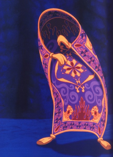 magical carpet of possibilities into the
 seven plus digits.
Could it be...maybe...just maybe she can
seven plus digits.
Could it be...maybe...just maybe she can
 open the latch on her secret chest and let her
 inner muse soar?
 How can that be? Having a windfall doesn't suddeny mean she has the talent to reach that unimaginable
 ...does it?
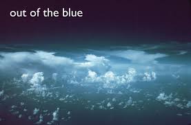
MAYBE TOO GOOD TO BE TRUE...
But then again, maybe Gabrielle's
...does it?
MAYBE TOO GOOD TO BE TRUE...
But then again, maybe Gabrielle's
 Magic Carpet Ride has arrived...
Can she place all her doubts behind her, reach for the brass ring, and if she does, will Elizabeth's son, the divorced head of the current
Magic Carpet Ride has arrived...
Can she place all her doubts behind her, reach for the brass ring, and if she does, will Elizabeth's son, the divorced head of the current
 Hasting's conglomerate bring her back down to that REAL world once more?
MAYBE TOO GOOD TO BE TRUE by Christy McKee released in August 2011 from
Hasting's conglomerate bring her back down to that REAL world once more?
MAYBE TOO GOOD TO BE TRUE by Christy McKee released in August 2011 from
 Muse It Up Publishing, Inc...and the buzz is
 "IT'S A WINNER!"
So step into the queue and claim your copy of this brilliant new voice's debut classic and then do like the rest of us, be ready, willing, and eager to snatch up the next Christy McKee original.
Available at MUSE IT UP PUBLISHING, INC. and where fine e-books are sold.
"IT'S A WINNER!"
So step into the queue and claim your copy of this brilliant new voice's debut classic and then do like the rest of us, be ready, willing, and eager to snatch up the next Christy McKee original.
Available at MUSE IT UP PUBLISHING, INC. and where fine e-books are sold.
Actually Kat and I have been actively attached to
 Muse It Up Publishing, Inc. LONGER than two years, but officially the Publishing House, under the able direction of
 Lea Schizas and her right hand Lady
 Litsa Kamateros, did not open to the world, until October 1, 2010...but Kat and I moseyed through the Muse Portals back in March 2010...
 Still this IS our Muse Second Birthday as well. and we've been given some truly rare treasures.
Those of us who've been here since BEFORE the beginning, have our own stories to tell.
For instance, I, L.J. Holmes beat the odds laid down by my former editor and agent, back in the
Still this IS our Muse Second Birthday as well. and we've been given some truly rare treasures.
Those of us who've been here since BEFORE the beginning, have our own stories to tell.
For instance, I, L.J. Holmes beat the odds laid down by my former editor and agent, back in the
 Dark Ages when all they told me I could write is
 poetry...miles, and miles and miles of much despised, by me, pentameter.
They assured me I am a pro with
poetry...miles, and miles and miles of much despised, by me, pentameter.
They assured me I am a pro with
 poetry and wallowing in the
 crapper with the rest of my creative flights of fancy.
Thankfully Muse and I guess the
crapper with the rest of my creative flights of fancy.
Thankfully Muse and I guess the
 world out there, didn't quite agree with Steven and Jeff, because not only am I a MULTI-PUBLISHED author now, I also have a 2010
 Top Ten P&E Award for my very FIRST released book,
 SANTA IS A LADY.
Thank you Lea and Litsa for having
SANTA IS A LADY.
Thank you Lea and Litsa for having
 in a woman old enough to know better...But you gave my
 dream wings and launched its flight.
Back to our TWO YEAR BIRTHDAY.
Kat and I came to Muse when it was just putting its
dream wings and launched its flight.
Back to our TWO YEAR BIRTHDAY.
Kat and I came to Muse when it was just putting its
 ducks in a row and plotting the months ahead. We feel like in our small way, we helped alert the world about this miracle about to happen...me with twelve
 blogs, (can't figure out many of the extras available on blogger so making new blogs my way of circumnavigating all I did not understand and still getting the job done)...and Kat with her
 BTR show and other means for bragging from the top of our cyber-lungs about Lea, Litsa and the Coming of Muse!
As I look back on these past two years, Kat and I can
BTR show and other means for bragging from the top of our cyber-lungs about Lea, Litsa and the Coming of Muse!
As I look back on these past two years, Kat and I can
 graph our ups and downs...and yes, there HAVE been some downs...does anyone know of a life that does NOT have downs? Ours we can follow via our HUGE caché of covers.
So Let's begin...I'll begin with SANTA IS A LADY and then travel the
graph our ups and downs...and yes, there HAVE been some downs...does anyone know of a life that does NOT have downs? Ours we can follow via our HUGE caché of covers.
So Let's begin...I'll begin with SANTA IS A LADY and then travel the
 time line through to the cover Kat JUST got.
I don't actually remember when I got my first cover. Originally our launch date was scheduled for December 1st 2010 and SIAL's contracted release date was December 1st, 2010...so my cover was one of the first.
You never forget your very first cover. It takes your breath away and makes your whole body start tingling. Every cover is an affirmation of you, the author's vision, coming to light, but the first one...Ahhh the first one...That's Nirvana.
time line through to the cover Kat JUST got.
I don't actually remember when I got my first cover. Originally our launch date was scheduled for December 1st 2010 and SIAL's contracted release date was December 1st, 2010...so my cover was one of the first.
You never forget your very first cover. It takes your breath away and makes your whole body start tingling. Every cover is an affirmation of you, the author's vision, coming to light, but the first one...Ahhh the first one...That's Nirvana.
 Santa Is A Lady ...I wrote this story in less than five days, and that for me, is slow. This cover set the standard for what I hoped all my future covers would be. How was I to know this cover would also show me what professional cover artists from some of the biggest houses consider "GOOD" cover artistry and more often than not, getting good covers can be a crap shoot?
January 2011 Kat, my supremely gifted daughter, already a Best Selling author's first Muse It Up Book released.
Santa Is A Lady ...I wrote this story in less than five days, and that for me, is slow. This cover set the standard for what I hoped all my future covers would be. How was I to know this cover would also show me what professional cover artists from some of the biggest houses consider "GOOD" cover artistry and more often than not, getting good covers can be a crap shoot?
January 2011 Kat, my supremely gifted daughter, already a Best Selling author's first Muse It Up Book released.
 THE LIGHTHOUSE..With this cover we both felt certain we'd hit the jackpot with cover excellence. We'd heard the horror stories from other authors, some of them International Best Selling Authors, about covers they're forced to accept no matter how much they hate them. Were we somehow more blessed?
Magic...it HAD to be the magic of Muse It Up Publishing and the amazing team Lea Schizas put together. I am, of course, speaking about the cover artists, the editors, the web mistress, and our co-leaders. They take our raw gems, polish them and let the diamonds within shine for you, the world waiting to read our little treasures.
Kat's The Lighthouse would win the 2011 top ten P&E Awards, just as Santa Is A Lady won the 2010 awards. Boy, were we Holmes Gals making up for lost time.
As with my first cover, you can read Kat's name, the title of her book and appreciate the well blended imagery that make her cover into the whole the world sees.
THE LIGHTHOUSE..With this cover we both felt certain we'd hit the jackpot with cover excellence. We'd heard the horror stories from other authors, some of them International Best Selling Authors, about covers they're forced to accept no matter how much they hate them. Were we somehow more blessed?
Magic...it HAD to be the magic of Muse It Up Publishing and the amazing team Lea Schizas put together. I am, of course, speaking about the cover artists, the editors, the web mistress, and our co-leaders. They take our raw gems, polish them and let the diamonds within shine for you, the world waiting to read our little treasures.
Kat's The Lighthouse would win the 2011 top ten P&E Awards, just as Santa Is A Lady won the 2010 awards. Boy, were we Holmes Gals making up for lost time.
As with my first cover, you can read Kat's name, the title of her book and appreciate the well blended imagery that make her cover into the whole the world sees.
 February 2011 my second book, a short story called FOREVER WITH YOU released. My CA had no idea what to do with this book. Originally another artist had been assigned to FOREVER WITH YOU, but life is like a roller coaster even in the publishing world. Things can change in a heartbeat, and it did.
The newly assigned CA struggled with what to do for this cover. This is not a typical story. The ending is shocking; its power unexpected.
She told me it is wrong to expect a cover to be an EXACT representation of your story...it is more an enticement for the reader to want to look beyond the cover and learn more. This cover does that brilliantly. You can read my name because the font style and coloring are clear and do not fade into the background scenery, and the background scenery is captivating...WELL DONE.
As authors, we are asked to fill out forms telling the CA's what we might like to see on our covers. I'm an author...NOT a visually gifted artist. I paint with words...CA's paint with visual concepts that I cannot fabricate in my head no matter how hard I try...so I should NEVER think I know what any cover for my stories needs.
Doing so defeats the natural skills of my CA's. My third book PROVES that.
February 2011 my second book, a short story called FOREVER WITH YOU released. My CA had no idea what to do with this book. Originally another artist had been assigned to FOREVER WITH YOU, but life is like a roller coaster even in the publishing world. Things can change in a heartbeat, and it did.
The newly assigned CA struggled with what to do for this cover. This is not a typical story. The ending is shocking; its power unexpected.
She told me it is wrong to expect a cover to be an EXACT representation of your story...it is more an enticement for the reader to want to look beyond the cover and learn more. This cover does that brilliantly. You can read my name because the font style and coloring are clear and do not fade into the background scenery, and the background scenery is captivating...WELL DONE.
As authors, we are asked to fill out forms telling the CA's what we might like to see on our covers. I'm an author...NOT a visually gifted artist. I paint with words...CA's paint with visual concepts that I cannot fabricate in my head no matter how hard I try...so I should NEVER think I know what any cover for my stories needs.
Doing so defeats the natural skills of my CA's. My third book PROVES that.
 March 2011 Muse released THE PENDULUM SWINGS.
I wrote a Time Travel story here with humor, confusion, passion, and mistrust. Being the uneducated visual creator I now know I am, I told my CA we needed the business man hero and the belly dancing heroine on the cover. Time has told me it probably would have been better if I'd kept it simple and only asked for a swaying pendulum, but we were all new back then...me, the wayward storyteller, and my CA.
Everyone told me how lucky I was to get Jimmy Thomas on my cover! Writers, like me, who've spent most their lives hibernating in their writing caves, barely remember Fabio...so gushing over Jimmy Thomas made my eyes cross.
I admit I'm no longer a Jimmy Thomas neophyte, and I'll get him on another cover, as will my daughter, but I also know he does not do starchy businessman well. I will also acknowledge Mr. Thomas doesn't like this cover either, but because of the belly dancer. I guess that's proof positive NEITHER should have been on this cover!
We live and learn!
April 2011 brings about one of the BEST covers Kat or I will ever get! When you still love a cover and think of it as one of your few ABSOLUTE favorites almost two years later, you know you've been blessed with a classically wondrous cover.
March 2011 Muse released THE PENDULUM SWINGS.
I wrote a Time Travel story here with humor, confusion, passion, and mistrust. Being the uneducated visual creator I now know I am, I told my CA we needed the business man hero and the belly dancing heroine on the cover. Time has told me it probably would have been better if I'd kept it simple and only asked for a swaying pendulum, but we were all new back then...me, the wayward storyteller, and my CA.
Everyone told me how lucky I was to get Jimmy Thomas on my cover! Writers, like me, who've spent most their lives hibernating in their writing caves, barely remember Fabio...so gushing over Jimmy Thomas made my eyes cross.
I admit I'm no longer a Jimmy Thomas neophyte, and I'll get him on another cover, as will my daughter, but I also know he does not do starchy businessman well. I will also acknowledge Mr. Thomas doesn't like this cover either, but because of the belly dancer. I guess that's proof positive NEITHER should have been on this cover!
We live and learn!
April 2011 brings about one of the BEST covers Kat or I will ever get! When you still love a cover and think of it as one of your few ABSOLUTE favorites almost two years later, you know you've been blessed with a classically wondrous cover.
 FROZEN, Book One in Kat's ARTICA LIGHTS SERIES is sich a cover.
Perfection, admittedly, like beauty, is in the eye of the beholder, but this cover brings Queen Awni of the land of perpetual cold to vivid life. Her skin, so frostily cold, her lips, bluer than her skin, her eyes deeply penetrating and breathtakingly haunting. She alone would have made this a cover alive with power, but brilliantly playing hide'n'seek throughout the cover's images are the lights...the
ARTICA lights...so vital to the core of this series' theme. Can you find them? The font and tone of the font's coloring also are masterfully done. All the images blend...no rough edges...in other words...perfection.
FROZEN, Book One in Kat's ARTICA LIGHTS SERIES is sich a cover.
Perfection, admittedly, like beauty, is in the eye of the beholder, but this cover brings Queen Awni of the land of perpetual cold to vivid life. Her skin, so frostily cold, her lips, bluer than her skin, her eyes deeply penetrating and breathtakingly haunting. She alone would have made this a cover alive with power, but brilliantly playing hide'n'seek throughout the cover's images are the lights...the
ARTICA lights...so vital to the core of this series' theme. Can you find them? The font and tone of the font's coloring also are masterfully done. All the images blend...no rough edges...in other words...perfection.
 May 2011 my first dark story releases. TWILIGHT COMES was a difficult book for me to write and to promote.
The cover is powerful, but I know now what some of the problems with this cover are. Matt, my story's central character, looks like he was plopped onto a green screen with the approaching storm playing out on that screen behind him. I can SEE his edges, almost like sparkly impressions where the green screen imagery and Matt compete for my eye's attention.
All images used on covers should appear like they are part of ONE whole...think of it like this...if you stand at an easel and paint a picture, all the textures are going to ebb and flow together because you are bringing into being ONE final painting no matter how many bits and pieces you etch, paint, or layer into your rendering. That is the very basis for judging good covers.
I LOVE this cover, sort of...the storm in the background is perfect...but Matt looks like a puzzle piece taken from another whole and dropped before the approaching storm without integrating the edges of Matt with the scenery of the storm. This would have been a stellar cover if Matt had been left off altogether...
But again, we were all learning this early in the Muse It Up legacy...none moreso than me!
June 2011 brought me my SECOND Jimmy Thomas Cover for
May 2011 my first dark story releases. TWILIGHT COMES was a difficult book for me to write and to promote.
The cover is powerful, but I know now what some of the problems with this cover are. Matt, my story's central character, looks like he was plopped onto a green screen with the approaching storm playing out on that screen behind him. I can SEE his edges, almost like sparkly impressions where the green screen imagery and Matt compete for my eye's attention.
All images used on covers should appear like they are part of ONE whole...think of it like this...if you stand at an easel and paint a picture, all the textures are going to ebb and flow together because you are bringing into being ONE final painting no matter how many bits and pieces you etch, paint, or layer into your rendering. That is the very basis for judging good covers.
I LOVE this cover, sort of...the storm in the background is perfect...but Matt looks like a puzzle piece taken from another whole and dropped before the approaching storm without integrating the edges of Matt with the scenery of the storm. This would have been a stellar cover if Matt had been left off altogether...
But again, we were all learning this early in the Muse It Up legacy...none moreso than me!
June 2011 brought me my SECOND Jimmy Thomas Cover for
 IN FROM THE COLD. Once again I was told I should be over the moon about having another Jimmy Thomas Cover. Sometimes naivité can excuse a lot of sins, but they'll eventually come back to bite you in the asteroid...as this one did.
The story takes place in a mountain with a blistering snow storm, the first of the season, about to hit. Originally Jimmy Thomas and his bathing suit clad model were presented with the masking curtain of white...to ape snow all the way up their chins...in the original image the CA purchased of these two, they are leaning against a stone wall with water crashing thunderously around them. Definitely NOT a snow scene.
Both Kat and I hated the opaque ever expanding ribbon of white reaching all the way up to their chins. My CA agreed to lower it, but by this time we knew we were novices so accepted having Jimmy and his blonde wearing bathing suits was NOT inappropriate for a snow scene...as long as the snow was thickly added down below to cover the crashing waves and rocky seascape almost naked people is okay.
This cover saddens me because the story was the very first new story I'd written in over ten years and I was proud of it. (SIAL was written AFTER In From the Cold even though it released first.) This is not a BAD cover, but neither is it right. Personally, I have not found having Jimmy Thomas on my cover a benefit at all.
June 2011 brought us Book One in Kat's GODS AT WORK SERIES with the release of
IN FROM THE COLD. Once again I was told I should be over the moon about having another Jimmy Thomas Cover. Sometimes naivité can excuse a lot of sins, but they'll eventually come back to bite you in the asteroid...as this one did.
The story takes place in a mountain with a blistering snow storm, the first of the season, about to hit. Originally Jimmy Thomas and his bathing suit clad model were presented with the masking curtain of white...to ape snow all the way up their chins...in the original image the CA purchased of these two, they are leaning against a stone wall with water crashing thunderously around them. Definitely NOT a snow scene.
Both Kat and I hated the opaque ever expanding ribbon of white reaching all the way up to their chins. My CA agreed to lower it, but by this time we knew we were novices so accepted having Jimmy and his blonde wearing bathing suits was NOT inappropriate for a snow scene...as long as the snow was thickly added down below to cover the crashing waves and rocky seascape almost naked people is okay.
This cover saddens me because the story was the very first new story I'd written in over ten years and I was proud of it. (SIAL was written AFTER In From the Cold even though it released first.) This is not a BAD cover, but neither is it right. Personally, I have not found having Jimmy Thomas on my cover a benefit at all.
June 2011 brought us Book One in Kat's GODS AT WORK SERIES with the release of
 WORKING UNDER COVERS.
There are covers that are elegant and this is certainly one, but this book is about Aphrodite, not a princess.
Kat and I both love the idea of the temple the CA will use in all Kat's GAW books...you can just about see it in the background beyond the windows.
Continuity in series presentation, our CA told us, is important, but Aphrodite calls to mind a goddess with long, flowing, golden hair, not an elegant woman with upswept dirty blonde hair. Also the font cannot be read...the coloring of it makes the words fade into the background so you can read SOME of the title, but not Kat's name nor the title of the series. This could have been better. Luckily book two in this series does improve.
August 2011 brings us Book Two in Kat's GODS AT WORK SERIES,
WORKING UNDER COVERS.
There are covers that are elegant and this is certainly one, but this book is about Aphrodite, not a princess.
Kat and I both love the idea of the temple the CA will use in all Kat's GAW books...you can just about see it in the background beyond the windows.
Continuity in series presentation, our CA told us, is important, but Aphrodite calls to mind a goddess with long, flowing, golden hair, not an elegant woman with upswept dirty blonde hair. Also the font cannot be read...the coloring of it makes the words fade into the background so you can read SOME of the title, but not Kat's name nor the title of the series. This could have been better. Luckily book two in this series does improve.
August 2011 brings us Book Two in Kat's GODS AT WORK SERIES,
 HEART OF THE QUEEN. This IS one of Kat's favorite covers. She asked the CA for only one thing...could she possibly put a peacock feather on the cover.
This is Hera's story and Hera's goddess symbol is peacocks. The CA took her breath away with adding the entire peacock. You can see the temple in the far background better on this cover, but again, the font disappears. However Hera, as the QUEEN of the Gods is perfect with HER upswept red-gold hair and delicate beauty.
Not a bad cover, but if you can't read the Title not a GREAT cover, either.
My August release,
HEART OF THE QUEEN. This IS one of Kat's favorite covers. She asked the CA for only one thing...could she possibly put a peacock feather on the cover.
This is Hera's story and Hera's goddess symbol is peacocks. The CA took her breath away with adding the entire peacock. You can see the temple in the far background better on this cover, but again, the font disappears. However Hera, as the QUEEN of the Gods is perfect with HER upswept red-gold hair and delicate beauty.
Not a bad cover, but if you can't read the Title not a GREAT cover, either.
My August release,
 THIS TIME FOREVER earned me the sexiest cover produced for Muse yet...and it IS powerfully HOT!
This is also a time travel and I love the club chairs on this side of the window representing the modern scene where much of the story originates, but feel too much "flora" was added on the other side of the window. You can read the title and my name. Still so not what I feel is a GREAT cover, but definetly a memorable cover.
September 2011 My very first cover with no PEOPLE on it released with
THIS TIME FOREVER earned me the sexiest cover produced for Muse yet...and it IS powerfully HOT!
This is also a time travel and I love the club chairs on this side of the window representing the modern scene where much of the story originates, but feel too much "flora" was added on the other side of the window. You can read the title and my name. Still so not what I feel is a GREAT cover, but definetly a memorable cover.
September 2011 My very first cover with no PEOPLE on it released with
 BEYOND YESTERDAY. The concept my CA used to create this cover blew me away.
This is a story about two homes slipping into deterioration from years of neglect. Blending the two homes, disintegrating despite their age and materials of construction...Brilliant!
I SOOOO want to claim this cover as perfect...but despite it's brilliance of design, it falls short because of the font. A lacey, elaborate font in this color plays hide'n'seek with the images.
That is the only thing about this cover that misses the mark. Sad...this is my second DARK story and the two buildings chosen to represent the two buildings in the story could not be more perfect. I want to LOVE this cover, but you can't read the title and the font chosen is far too fanciful for such a dark cover.
October 2011...Muse celebrates its first birthday and I, L.J. Holmes release
BEYOND YESTERDAY. The concept my CA used to create this cover blew me away.
This is a story about two homes slipping into deterioration from years of neglect. Blending the two homes, disintegrating despite their age and materials of construction...Brilliant!
I SOOOO want to claim this cover as perfect...but despite it's brilliance of design, it falls short because of the font. A lacey, elaborate font in this color plays hide'n'seek with the images.
That is the only thing about this cover that misses the mark. Sad...this is my second DARK story and the two buildings chosen to represent the two buildings in the story could not be more perfect. I want to LOVE this cover, but you can't read the title and the font chosen is far too fanciful for such a dark cover.
October 2011...Muse celebrates its first birthday and I, L.J. Holmes release
 SUC-U, a tongue-in-cheek HOT journey with...oh wow...an AMAZINGLY HOT cover...much hotter than my cover for THIS TIME FOREVER was. I only wish the font didn't fade into the background so you cannot read my name as the author's without struggling.Other than the font, it's a powerful cover.
November 2011 brings Kat one of her BEST EVER covers with
SUC-U, a tongue-in-cheek HOT journey with...oh wow...an AMAZINGLY HOT cover...much hotter than my cover for THIS TIME FOREVER was. I only wish the font didn't fade into the background so you cannot read my name as the author's without struggling.Other than the font, it's a powerful cover.
November 2011 brings Kat one of her BEST EVER covers with
 DANGEROUS VOICE. Both Kat and I LOVE this cover. The CA was only told the cover needed a red phone...the central point in the story...and the CA came up with absolutely the most brilliant cover either Kat or I had seen in a long time. The placement of the title and author's name against the white background is PERFECTION TO THE Nth degree. WELL DONE ALL!
For me, I too can claim an excellent cover for November
DANGEROUS VOICE. Both Kat and I LOVE this cover. The CA was only told the cover needed a red phone...the central point in the story...and the CA came up with absolutely the most brilliant cover either Kat or I had seen in a long time. The placement of the title and author's name against the white background is PERFECTION TO THE Nth degree. WELL DONE ALL!
For me, I too can claim an excellent cover for November
 CHAMAPAGNE AFTERNOON. This is another example of brilliance in the hands of a CA that delivered outside the box. Champagne Afternoon is an odd story that happens in a place unlike most stories, yet the CA doesn't even HINT at the unusual locale...instead gave me an elegant cover where EVERYTHING is clear and enticing. I LOVE this cover and it really is one of my best.
I wish I could say my December 2011 cover is one of my favorites...It's the sequel to Santa Is A Lady, and book two in my CHRISTMAS MIRACLES SERIES but I HATE the cover I got for
CHAMAPAGNE AFTERNOON. This is another example of brilliance in the hands of a CA that delivered outside the box. Champagne Afternoon is an odd story that happens in a place unlike most stories, yet the CA doesn't even HINT at the unusual locale...instead gave me an elegant cover where EVERYTHING is clear and enticing. I LOVE this cover and it really is one of my best.
I wish I could say my December 2011 cover is one of my favorites...It's the sequel to Santa Is A Lady, and book two in my CHRISTMAS MIRACLES SERIES but I HATE the cover I got for
 THE CHRISTMAS WAR. What a disappointment after the brilliant cover I got for SIAL. I hate this cover so much...my hero and heroine are in their mid thirites, but I was given CHILDREN.
This would have been better if my CA had REMOVED the people and left the church behind them you can see if you hunt for the spire above the cartoonish hero and heroines head. Like Matt in TWILIGHT COMES, these two look like they were plunked down in front of a green screen, but worse. They also look like they were popped together in a way you know they were never in the same place at the same time, let alone reaching out to hold each other.
This is a SUPER BAD cover. The Font doesn't hide, but the rest of the cover is so bad, I wish it did fade.
January 2012 Kat released book three in her Gods At Work Series,
THE CHRISTMAS WAR. What a disappointment after the brilliant cover I got for SIAL. I hate this cover so much...my hero and heroine are in their mid thirites, but I was given CHILDREN.
This would have been better if my CA had REMOVED the people and left the church behind them you can see if you hunt for the spire above the cartoonish hero and heroines head. Like Matt in TWILIGHT COMES, these two look like they were plunked down in front of a green screen, but worse. They also look like they were popped together in a way you know they were never in the same place at the same time, let alone reaching out to hold each other.
This is a SUPER BAD cover. The Font doesn't hide, but the rest of the cover is so bad, I wish it did fade.
January 2012 Kat released book three in her Gods At Work Series,
 In Death's Arms. Yep, this is Kat's Jimmy Thomas cover and he works REALLY well as the Greek God Hades don't you think? The temple in the background is well illuminated giving more definition for THAT recurring image, but the font and its coloring falls short, yet again.
You cannot see the series designation without struggle, and even the title plays with your ability to see the lettering. The CA said something about making the font "orange" because the story takes place around Halloween and organge coloring would honor that...
I suppose that might've worked...IF you could see it's orange, and if you knew ahead of time the story takes place at Halloween. Releasing in January would not alert anyone to that little tidbit.
February 2012 my short story
In Death's Arms. Yep, this is Kat's Jimmy Thomas cover and he works REALLY well as the Greek God Hades don't you think? The temple in the background is well illuminated giving more definition for THAT recurring image, but the font and its coloring falls short, yet again.
You cannot see the series designation without struggle, and even the title plays with your ability to see the lettering. The CA said something about making the font "orange" because the story takes place around Halloween and organge coloring would honor that...
I suppose that might've worked...IF you could see it's orange, and if you knew ahead of time the story takes place at Halloween. Releasing in January would not alert anyone to that little tidbit.
February 2012 my short story
 SHE'S GONE earns me my absolute BEST cover to date. This is a mystery story with a few twists.
This cover is BRILLIANT in its simplicity...and you have no trouble reading the title and my name.
I love this cover SOOOO much I got permission from the CA to blow it up into a wall sized poster to decorate my living room wall here at home. It's an extra expense to enlarge our covers into posters...So far Kat's THE LIGHTHOUSE is the only one we've done that with...but this cover is slated for our second...that's how much I LOVE this cover.
April 2012 Kat's fourth GODS AT WORK SERIES book released with one of our worst covers ever.
SHE'S GONE earns me my absolute BEST cover to date. This is a mystery story with a few twists.
This cover is BRILLIANT in its simplicity...and you have no trouble reading the title and my name.
I love this cover SOOOO much I got permission from the CA to blow it up into a wall sized poster to decorate my living room wall here at home. It's an extra expense to enlarge our covers into posters...So far Kat's THE LIGHTHOUSE is the only one we've done that with...but this cover is slated for our second...that's how much I LOVE this cover.
April 2012 Kat's fourth GODS AT WORK SERIES book released with one of our worst covers ever.
 CRIMSON WATERS is Poseidon's story and none of the Greek Gods have an African American torso, nor what people mistake for wet rock ledges. This image was supposed to be lightened, but it slipped through as is...a BAD representation of the Greek Gods, and please note...the temple almost is completely gone. There's a very SLIGHT hinting of it to your left, but the naked torso or wet rocl ledge make you question what you think you're seeing.
I do not know why the font continues to fade into the background, but it does for this entire series, over and over again!
June 2012 Kat received a nearly perfect cover for the first book in her Hekate's Web Series,
CRIMSON WATERS is Poseidon's story and none of the Greek Gods have an African American torso, nor what people mistake for wet rock ledges. This image was supposed to be lightened, but it slipped through as is...a BAD representation of the Greek Gods, and please note...the temple almost is completely gone. There's a very SLIGHT hinting of it to your left, but the naked torso or wet rocl ledge make you question what you think you're seeing.
I do not know why the font continues to fade into the background, but it does for this entire series, over and over again!
June 2012 Kat received a nearly perfect cover for the first book in her Hekate's Web Series,
 HIDDEN. Kat found the heroine's image and sent it to the CA. She's perfect for Lilith, Hekate's CHOSEN created vampiress and the CA agreed.
Kat told the CA a web needed to be included on the covers for this series because the series is entitled HEKATE'S WEB. The title can be clearly read, as can the author's name, but the series is so small it fades then comes back out, like a little kid playing peek-a-boo with the dark cavern behind the web.
Kat LOVES this cover anyway...how could she not love a cover with HER dilligent search for the image of Lilith the one chosen by the CA and the web so deliciously displayed too?
My own June 2012 cover
HIDDEN. Kat found the heroine's image and sent it to the CA. She's perfect for Lilith, Hekate's CHOSEN created vampiress and the CA agreed.
Kat told the CA a web needed to be included on the covers for this series because the series is entitled HEKATE'S WEB. The title can be clearly read, as can the author's name, but the series is so small it fades then comes back out, like a little kid playing peek-a-boo with the dark cavern behind the web.
Kat LOVES this cover anyway...how could she not love a cover with HER dilligent search for the image of Lilith the one chosen by the CA and the web so deliciously displayed too?
My own June 2012 cover
 LIFE'S JOURNEY SHOULD be among my favorites. I WANTED it to be. This story has a place inside my heart so deep I NEEDED perfection to honor that place.
The image is ASTOUNDINGLY gut wrenching in its perfection, but the font is nothing short of crap, thrown onto the background and not once modified for readibility afterwards.
I weep every time I see this cover.
This story is dear to me, but the font so blatantly wrong you struggle so hard to read the title it might as well have been written by ANONYMOUS so badly is my author's name and yes, the title presented.
I don't know why the fonts have gotten so fanciful and difficult over the months. Sometimes I feel like I'm playing a game of "Where's Waldo?" when I try to decipher the fonts coming our way of late for both Kat and me.
Kat's June 2012 release, Book Five in her GAW series,
LIFE'S JOURNEY SHOULD be among my favorites. I WANTED it to be. This story has a place inside my heart so deep I NEEDED perfection to honor that place.
The image is ASTOUNDINGLY gut wrenching in its perfection, but the font is nothing short of crap, thrown onto the background and not once modified for readibility afterwards.
I weep every time I see this cover.
This story is dear to me, but the font so blatantly wrong you struggle so hard to read the title it might as well have been written by ANONYMOUS so badly is my author's name and yes, the title presented.
I don't know why the fonts have gotten so fanciful and difficult over the months. Sometimes I feel like I'm playing a game of "Where's Waldo?" when I try to decipher the fonts coming our way of late for both Kat and me.
Kat's June 2012 release, Book Five in her GAW series,
 DANCES AT DAWN has many pluses but the same old negatives...bad font and bad coloring and sizing of font. On the positive side you can really see the temple background CLEARLY for the first time since the series's first appeared. And for the first time the God and/or Goddess appears not ALONE but with in this case Apollo's mate. I love the dancing lights added to the background too.
Not a BAD cover, but it had so much potential to be a GREAT cover!
Kat and I have our first collaboration
DANCES AT DAWN has many pluses but the same old negatives...bad font and bad coloring and sizing of font. On the positive side you can really see the temple background CLEARLY for the first time since the series's first appeared. And for the first time the God and/or Goddess appears not ALONE but with in this case Apollo's mate. I love the dancing lights added to the background too.
Not a BAD cover, but it had so much potential to be a GREAT cover!
Kat and I have our first collaboration
 HER LAST DAY coming out this month, October 2012, and the cover is one we love even though the smoke in the background does not say "volcano." Everything else about the cover is PERFECTION including the font. We worked hard to bring Daria's story to life so are grateful this cover is so good.
Kat has her Lacey's Lamp book, part of a year long series our amazing Publisher, Lea Schizas proposed for all authors to take a chance on. Kat's is called HANNAH'S WISH and is coming out in November. We both ADORE this cover. There's nothing our CA friends tell us is lacking. In short...it's PERFECT.
That brings me to the final 2012 cover for either of us, Kat and book two in her Artica Lights Series,
HER LAST DAY coming out this month, October 2012, and the cover is one we love even though the smoke in the background does not say "volcano." Everything else about the cover is PERFECTION including the font. We worked hard to bring Daria's story to life so are grateful this cover is so good.
Kat has her Lacey's Lamp book, part of a year long series our amazing Publisher, Lea Schizas proposed for all authors to take a chance on. Kat's is called HANNAH'S WISH and is coming out in November. We both ADORE this cover. There's nothing our CA friends tell us is lacking. In short...it's PERFECT.
That brings me to the final 2012 cover for either of us, Kat and book two in her Artica Lights Series,
 REFLECTIONS OF ICE...and OMG is it ever PERFECT! This means Kat's Artica Lights Series has ONLY radaited perfection. Both covers are going to end up as posters in the weeks; months ahead.
So here we are celebrating OUR second birthday with Muse and we have been richly blessed, and here are the gifts we've opened and look back on with the same joy we felt upon first opening them..
L.J. Holmes
1.) Santa Is A Lady...December 2010
2.) Forever With You...February 2011
3.) Champagne Afternoon...November 2011
4.) She's Gone...February 2012
5.) Her Last Day...collab with Kat...October 2012
Kat Holmes
1.) The Lighthouse...January 2011
2.) Frozen...April 2011
3.) Dangerous Voice...November 2011
4.) Hidden...June 2012
5.) Her Last Day...collab with me...October 2012
6.) Hannah's Wish...November 2012
7.) Reflections of Ice...December 2012
And now we look forward to more excitement, more exceptional covers, and our Muse Family...we love them all...growing by leaps and bounds.
REFLECTIONS OF ICE...and OMG is it ever PERFECT! This means Kat's Artica Lights Series has ONLY radaited perfection. Both covers are going to end up as posters in the weeks; months ahead.
So here we are celebrating OUR second birthday with Muse and we have been richly blessed, and here are the gifts we've opened and look back on with the same joy we felt upon first opening them..
L.J. Holmes
1.) Santa Is A Lady...December 2010
2.) Forever With You...February 2011
3.) Champagne Afternoon...November 2011
4.) She's Gone...February 2012
5.) Her Last Day...collab with Kat...October 2012
Kat Holmes
1.) The Lighthouse...January 2011
2.) Frozen...April 2011
3.) Dangerous Voice...November 2011
4.) Hidden...June 2012
5.) Her Last Day...collab with me...October 2012
6.) Hannah's Wish...November 2012
7.) Reflections of Ice...December 2012
And now we look forward to more excitement, more exceptional covers, and our Muse Family...we love them all...growing by leaps and bounds.
 HAPPY BIRTHDAY MUSE.

.jpg)

